Your greeting cards have been designed to perfection. You’ve spent the time and effort to make sure the design, the colours, the board, the finishes and the text work together to seamlessly to create a card people will want to send and receive. But you need to convey this passion in photos – your products need to look their best online and in your printed catalogues.
Taking the perfect photo can be a source of frustration. But with a bit of inside knowledge from GCA member Richard Jackson of Forever Creative Photography, your product photos can do justice to your cards.
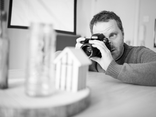
1. Getting your card artwork to look sharp
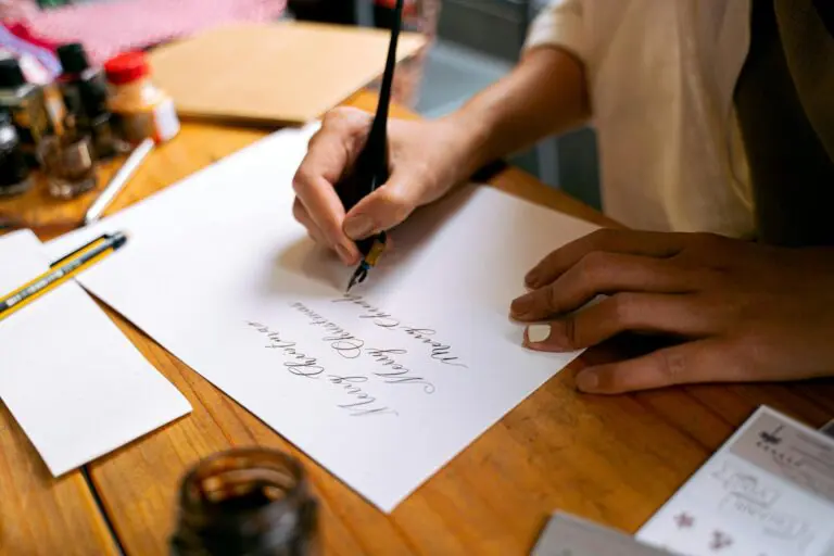
Whilst some images can be taken while hand holding the camera, a tripod is essential for most. By using a tripod you can ensure that the camera is focused upon your product, and then you can use the built-in self timer to take the image. Even when the camera is fitted to a tripod, the movement when pressing the shutter button can still affect sharpness so don’t forget to use the self timer, or even better a shutter release cable. Simply ‘Google’ shutter release cable and your camera model to find a suitable example.
Don’t rely on the small screen on the back of the camera, check images on a larger screen. Sometimes subtle blur isn’t noticeable until you get it on a larger screen. Inexpensive tripods can be easily obtained and will greatly improve the sharpness of your product images. These can be found easily on eBay and other similar locations.
In some scenes automatic focus can struggle to accurately focus, similarly manually focusing can sometimes be difficult if there isn’t an area of high contrast for you to focus on. In these situations, it can be useful to have something else to focus upon and place in the scene. Something like a barcode printed out would be ideal and can be quickly placed by the side of your product before being moved out of shot. Or a card with a target printed in the centre, as mentioned later in this article.
If you’re using Photoshop to process your images it’s best to use the ‘Unsharp Mask’ feature under the Filter/Sharpen menu to increase sharpness selectively to your artwork, whilst avoiding over-sharpening.
2. Getting the colours right
It’s worth noting that it’s not always possible to get exactly the same colour that’s printed on your cards. If your card has been printed with spot colours and varnishes, then these are not always reproduceable using the RGB colour gamut. Similar to them not being available in the CMYK colour palette, which is why you specified a spot colour in the first place.
Having a quality monitor is also important. Don’t simply assume that because you’re using a Mac (particularly a laptop) it will be colour calibrated. MacBooks as a rule do tend to be more accurate than other PC Laptop monitors but you can’t beat a desktop monitor.
However when attempting to achieve as accurate colours as possible, this is primarily done through calibrating the white balance properly.
2.1 White Balance
Colour temperatures change throughout the day and with different lighting sources. We don’t notice this as our eyes adjust automatically but a camera doesn’t always get it right. Setting the white balance correctly will ensure that all colours are correct and appear without any distracting colour cast.
If you are using natural light, ensure that any other lighting is switched off. If you have lamps or fluorescent lighting in the scene, the mixed colour temperatures will show up in the image. It will also make it very difficult to select the correct white balance.
By removing other light sources from the scene it will also make it more likely that your camera can select the correct white balance straight away. All digital cameras will let you adjust the white balance settings. You will most likely have to switch to manual mode, what you want is for white and grey areas to appear correctly. If they’re too cold or too warm the image will look unprofessional. If your camera only allows presets for the white balance use the cloudy or sunlight setting.
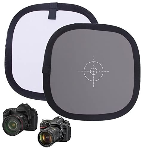
For even further accuracy purchase a white balance card, which strangely enough is usually grey! You can purchase them online very easily, and some also comes with a target focus point on the middle of the card, which is useful in certain scenes where focussing is difficult.
You’ll then be able to use the Custom White Balance setting, and set it using the grey card, by placing it within your shot.
When processing your images there are lots of ways to adjust the colours if you can’t quite get them right in camera. I would recommend sticking to altering the white balance, and also the use of the Photo Filter (Image/Adjustments/Photo Filer) in Photoshop. Otherwise you’ll be mixing colours until the cows come home! It’s worth bearing in mind, this is one of the many reasons why you should always take your shots in the RAW setting, and not simply JPEG. This then saves all the colour information, and you can adjust the white balance much more easily.
3. Lighting your work
3.1 Using Natural Light
There are very few applications for on-camera flash in product photography, they’re simply too direct and too harsh. If you use a table or surface placed next to a large window it saves on investing in any lighting equipment, and it also provides a beautifully soft appearance to your products. If you’re using sunlight, photograph at the same time of day to achieve consistent lighting. It’s worth bearing in mind that windows will differ in the amount of appropriate illumination they can provide, mainly due to their orientation. It’s best to use a North facing window, just like an artist would for the most diffused and continual soft light. Not everyone will have access to that, but you can easily diffuse the light by placing a diffusion material across the window. You could use tracing paper, a voile, or a white bed sheet.
When lighting with window light, always position your product by the side of the window not directly in front of it. This will provide the best type of natural illumination. It will provide you with a bright side where the light is striking the product and a shadow side. This shadow side will typically be too dark but you can use a piece of white card or foam-board, to reflect light back into the shadows. Foam-board makes a great bounce card, because it’s rigid and white. Small pieces of white and black card are also handy for blocking or reflecting smaller areas. Pieces of black card can be used to prevent highlights (areas of too much light) within your scene.
It takes a little practice and experimentation to get them in the right place but it can make quite a difference to the finished image.
Again remember to ensure that any lamps or artificial lighting is switched off, so that you’re using only one light source.
3.2 Using artificial light sources
There are various types of relatively inexpensive studio lights to choose from. Ranging from studio strobes (Flash), to Tungsten and LED. The primary difference between these groups is that strobes only appear for a split second, whereas Tungsten and LED are both forms of continuous lighting. This makes the continuous lighting easier to work with as what you see is what you get as you can see how shadows fall and whether there are any highlights. Whereas the Flash only appears momentarily o you need to have more knowledge of lighting to use them. Flash/strobe units do have modeling lamps, which are to give you an approximate idea of the fall of shadows and the lighting in general. However these are often under-powered in comparison to the primary flash bulb and don’t therefore give a true sense of what the image may look like when the flash is fired.
That said most professionals do choose to use strobes, but for you to photography your own work probably the best choice would be LED. LED is taking over from Tungsten now and the prices have come down considerably. The disadvantage of tungsten has always been that the lamps become very hot and can heat up the object you’re working with.
There are various additional items you would need, but are very often sold as kits anyway. These include the stands for the light heads, and light modifiers. There are various different types of modifiers but the most common and useful are softboxes. Preferably two lights with stands and softboxes would be a very good starting point.
Generally clients want a soft overall appearance to mimic a lifestyle setting or sunlight and this is what softboxes do really well.
4. Capturing Reflective and Special Finishes
Continuing from discussing artificial light sources, if you have reflective finishes on your cards, things get a little more difficult and just simply relying on natural light doesn’t always work. It’s all about bouncing light around within the scene selectively, and the source location of the light now becomes very important. Another important factor to consider now is the camera angle of the shot. The more in line the camera is to the card, the easier it will become to bounce light from the card directly back to the camera lens.
Then its a case of balancing the light between the two lights, one to light your card, and overall scene, and one to highlight the reflective elements within your design.
Place one light to the left or right of the scene and one behind the camera. It may take a little experimentation with power settings, and exact placement of the lights
When setting up both the power of the lights and the exact location and direction that it is pointing, its beneficial to switch one light off so you can concentrate on one a time. Also make sure you’re area isn’t flooded with light from nearby windows, it will be best to cover those up, or draw the curtains.
Then you can light the scene from the side, make sure it’s a little darker than you require as you’re going to add in more light from the light behind the camera.
The light from behind the camera is the light that directly to the lens and illuminates the foils and finishes.
5. What aperture to use
The basics of this are very simple use a wide aperture to isolate your object from its background and foreground, or use a narrow aperture to have the whole of the scene into focus.
Wide apertures are for blurring the background and foreground, and are apertures with smaller numbers, such as F2.8, F3.5, and sometimes F5.6 depending on the size of your scene.
Narrow apertures are for presenting the entire scene in focus, and are a higher number from F8, F11 up to around F16 (Using very small apertures such as F22, and sometimes F16 can present problems such as diffraction (which is a general lack of sharpness) on cameras and indeed phones that don’t have large sensors).
6. What camera angle to use
6.1 The 3d type shot
This shot shows a small portion of the inside the card and is generally taken from a slightly higher angle.
If the image were then to be shown alongside other types of products, a potential customer can instantly see and recognise the type of product. Particularly when selling on marketplaces where there are many different types of products.
6.2 Hero shot
This next type of shot, which I’ll loosely term a hero shot for the purposes of this guide. Although it now becomes a little more difficult to tell what type of product this is, there are other advantages which include:
- All of the design printed on the card is in perfect focus.
- It’s now much easier for foils to show their reflective elements properly.
- It isolates the card design from the rest of the scene, the card needs to be the star of the image of course.
- Your card / design becomes the most prominent feature of the shot.
In both these shots the horizon line behind (if you want one) doesn’t always need to be level although it does present a nice clean image if it is. If you do want an angled backdrop, make sure its quite an angle, and not too subtle as this can look like you’ve made an error while trying to get a horizontal backdrop line straight and level.
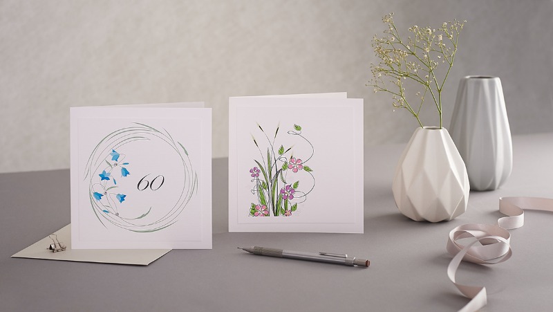
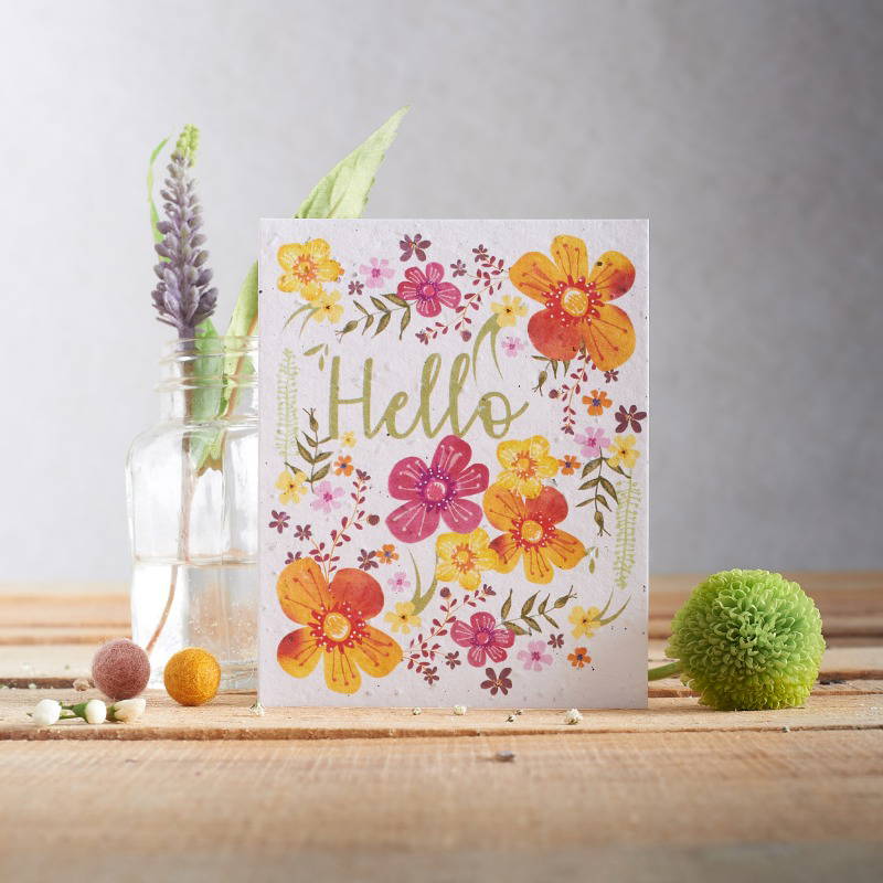
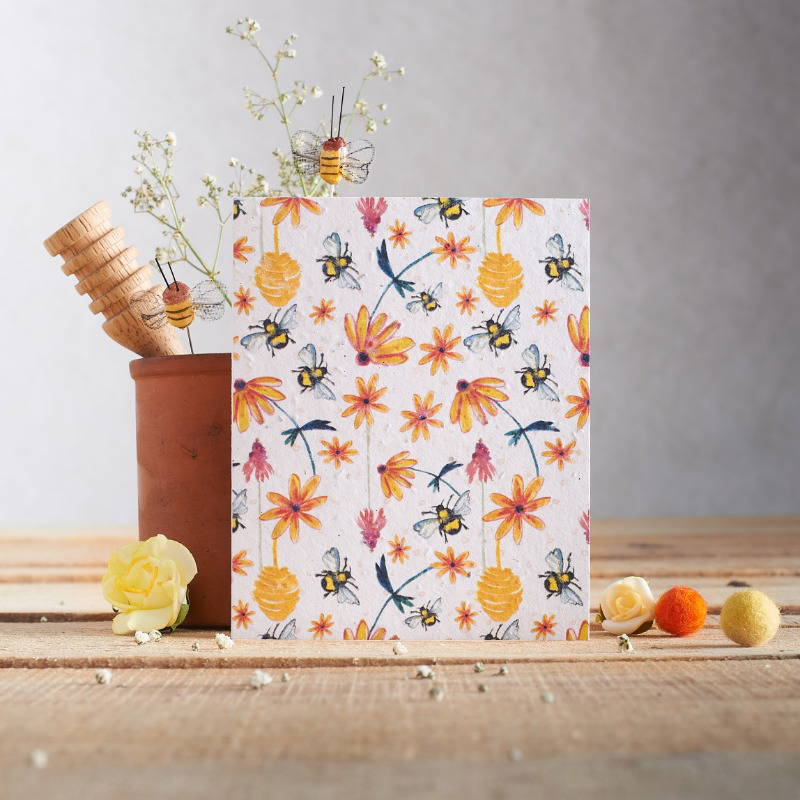
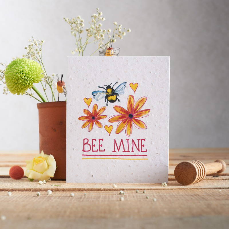
7. Consistency across your images
Client : Hannah Marchant Illustrates
To achieve any sort of consistency between shots it’s essential to have a tripod. By keeping your photographs simple and ensuring they are consistent it will make your photography appear more professional. By consistent, I mean a consistent overall setting, with the product position being the same on each photograph. It’s always possible to improvise a way to hold a camera or phone in position, but for the sake of a very minimal outlay you may as well just order a simple and inexpensive tripod.
Don’t forget to mark the position of your product on the surface so can easily re-position a new product in there each time. If the pencil mark does show on the final images, its easy to remove these in Photoshop.
In the examples above the card position and surface remain static while the props are moved to create difference between the images.
7.1 Differentiating Shots in a Sequence
Many products are sold in ranges, and for these it’s best to create one setting for the entire range, and make adjustments throughout with the props to differentiate the photographs. Really to show all the photographs are unique. Sometimes, foreground objects are all that are changed, other times it could be background objects. Other visual cues such as colour coordinating items between shots can be used to good effect.
It’s best to have more than one image of your product to use on your website. Turn your work area it into a production line, have your camera or phone in one position and photograph each product in one setting/angle then go through all the products again to do the second angle/setting. That’s the best way to ensure consistency between shots, and having the same framing and angles throughout will give you a very consistent and professional appearance.
Use conventional standardised angles for your images. Don’t try to be overly creative with them. They’re difficult to repeat, but even more importantly strange camera angles can be distracting, it’s the product that needs to be the ‘hero’ of the shot.
Forever Creative Photography
Richard Jackson, runs the Forever Creative photography studio and specialises in creating product and lifestyle imagery for brands, creatives and designer makers all across the UK which has been published online and in-print. It’s more important than ever to represent your business well, particularly online, the Forever Creative studio, provides an efficient, creative, and convenient way to get the images you need.
Working solely from the studio, which means you don’t have to spend your time at the shoot, as well as paying for a photographer. I’ve worked with many GCA members and would be happy to discuss possibilities and ideas with any members, there’s also a 10% discount on your first two shoots. The studio has been developed to be an interior style backdrop for shoots, and also contains an extensive range of backgrounds, furniture and props.