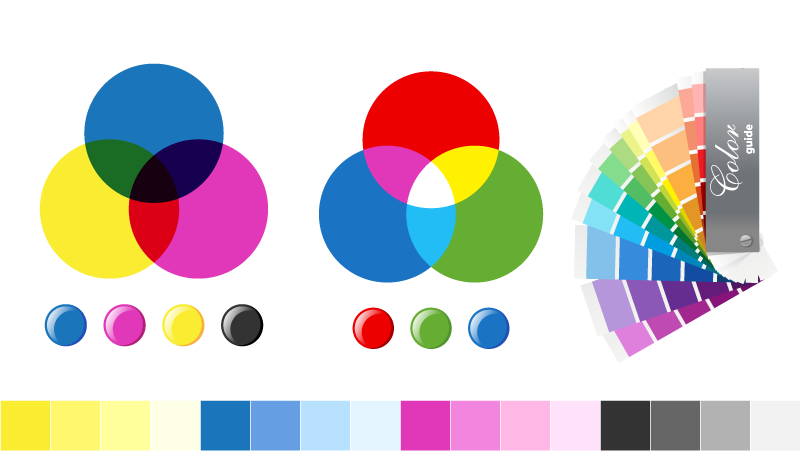
Part 4 of 8: This article on Colour Modes explains everything you need to know about RGB, CMYK, Pantone and how to choose what to use.
Part 4 of 8: This article on Colour Modes explains everything you need to know about RGB, CMYK, Pantone and how to choose what to use.
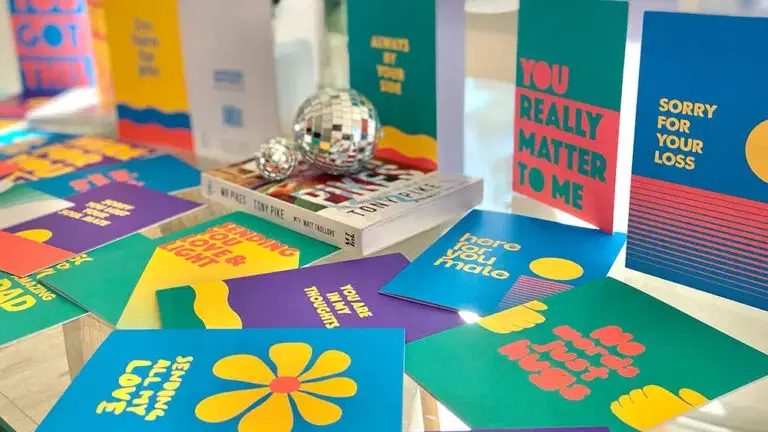
In conversation with Rachel from Love Loss Discoballs, sharing her journey through grief and meaningful connections.
Guidelines for designers and publishers designing cards for bereaved children. Produced by the GCA with Winston’s Wish, a charity supporting bereaved children.
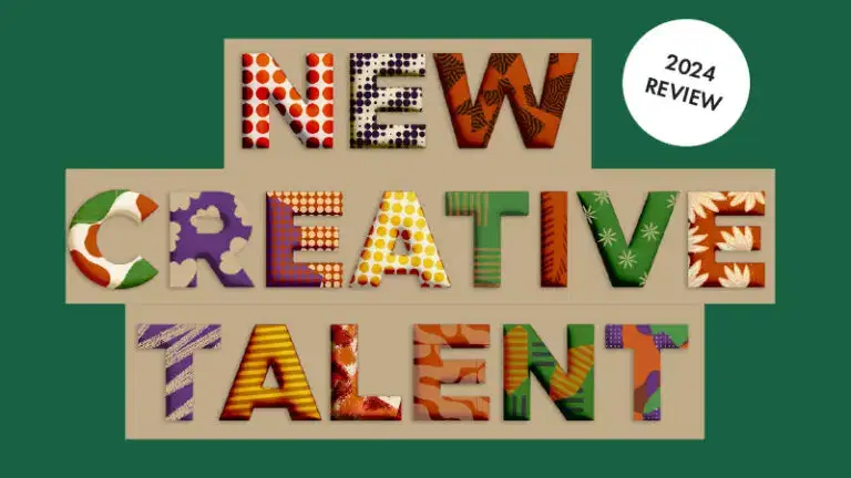
GCA’s New Creative Talent project has built up a series of resources to support GCA members looking to recruit new creative talent,, and to offer a route into the industry for those looking to join.

GCA top tips to recruit new creative talent and help from the expects to build successful working relationships with new designers and others joining your team.
Are you a student considering a career in the greeting card industry? This blog details some ways to access the industry, and has links to lots more information.
See here if you’re looking to recruit New Creative Talent in 2024