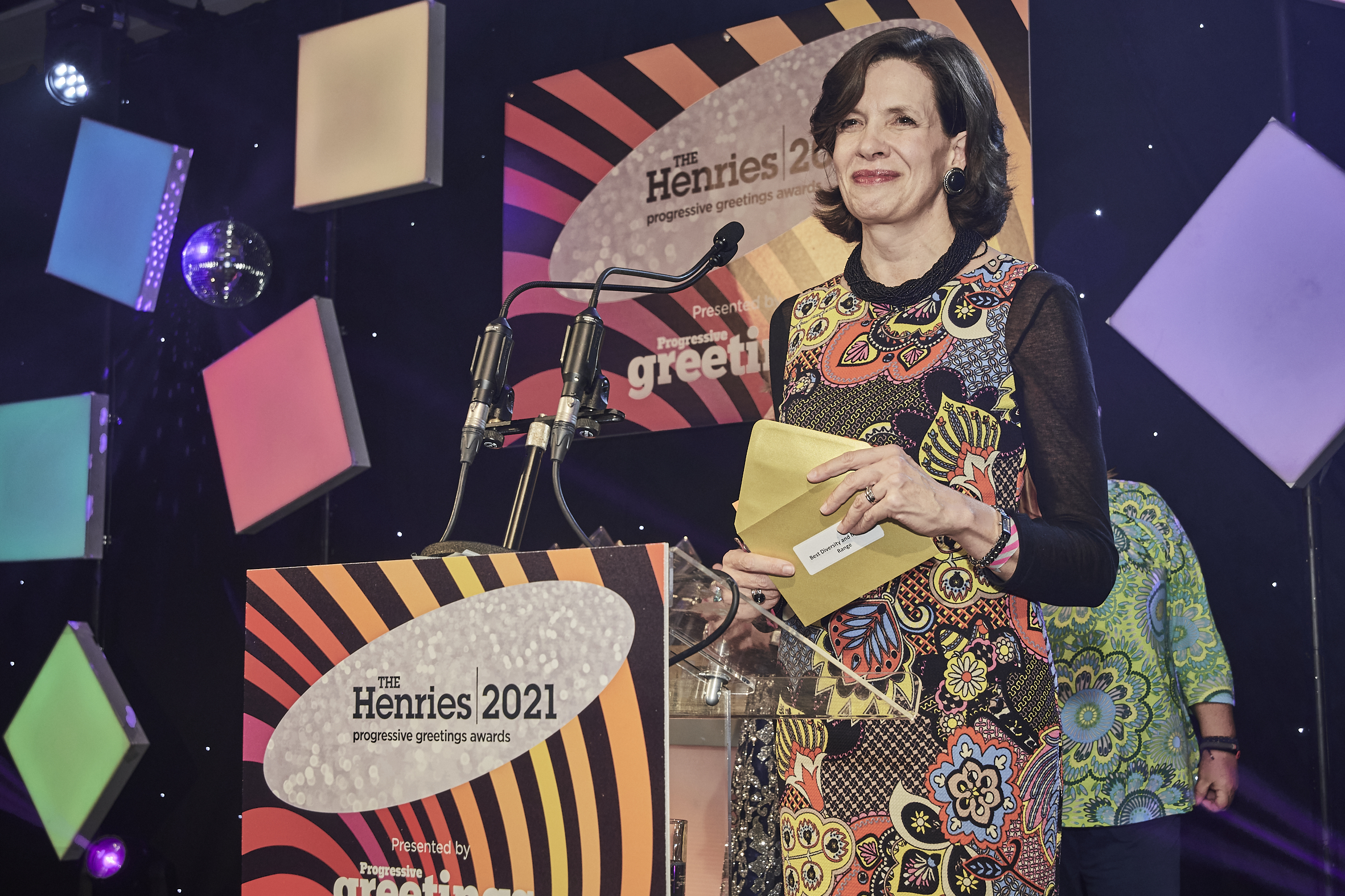
The annual Henries Awards celebrate design and innovation in the world-leading UK greeting card industry. With over 14,000 cards entered each year, the awards celebrate the best new designs across all genres.
The Henries Award for Diversity and Inclusion was first launched in 2021 with GCA sponsorship see our blog for more details, we are delighted to sponsor this award again in 2022.
Initiatives like this allow the GCA to continue to promote diversity in our industry, both raising the profile of the greeting card industry with consumers and also encouraging retailers and publishers to continue the drive to ensure that all communities are represented on cards.
Entry is free of charge, and closes 15 June 2022. To enter visit the Henries website.
Progressive Greetings‘ Jakki Brown interviewed the finalist of the 2021 Henries awards:
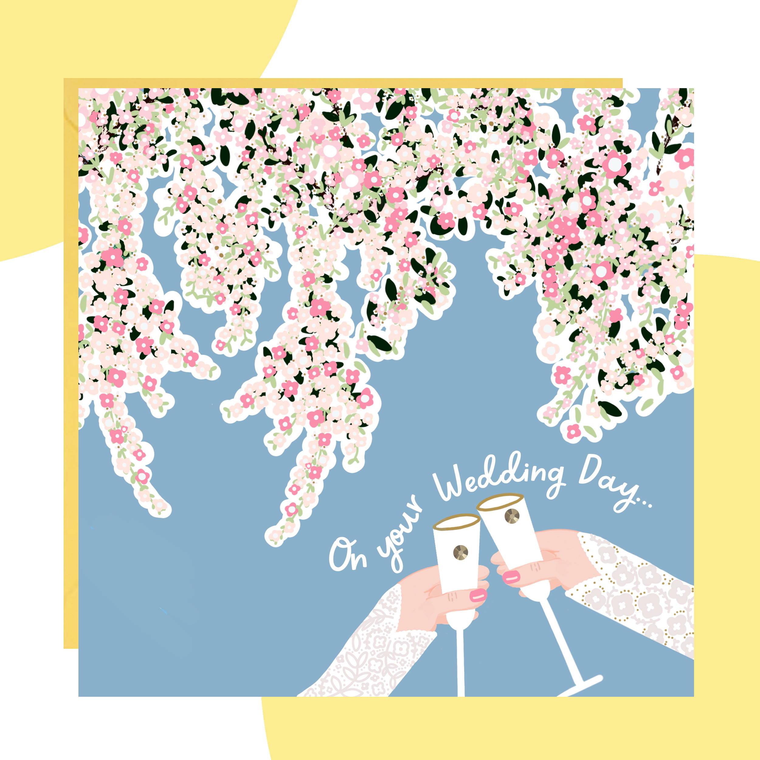
Live in Colour Collection from AfroTouch Design
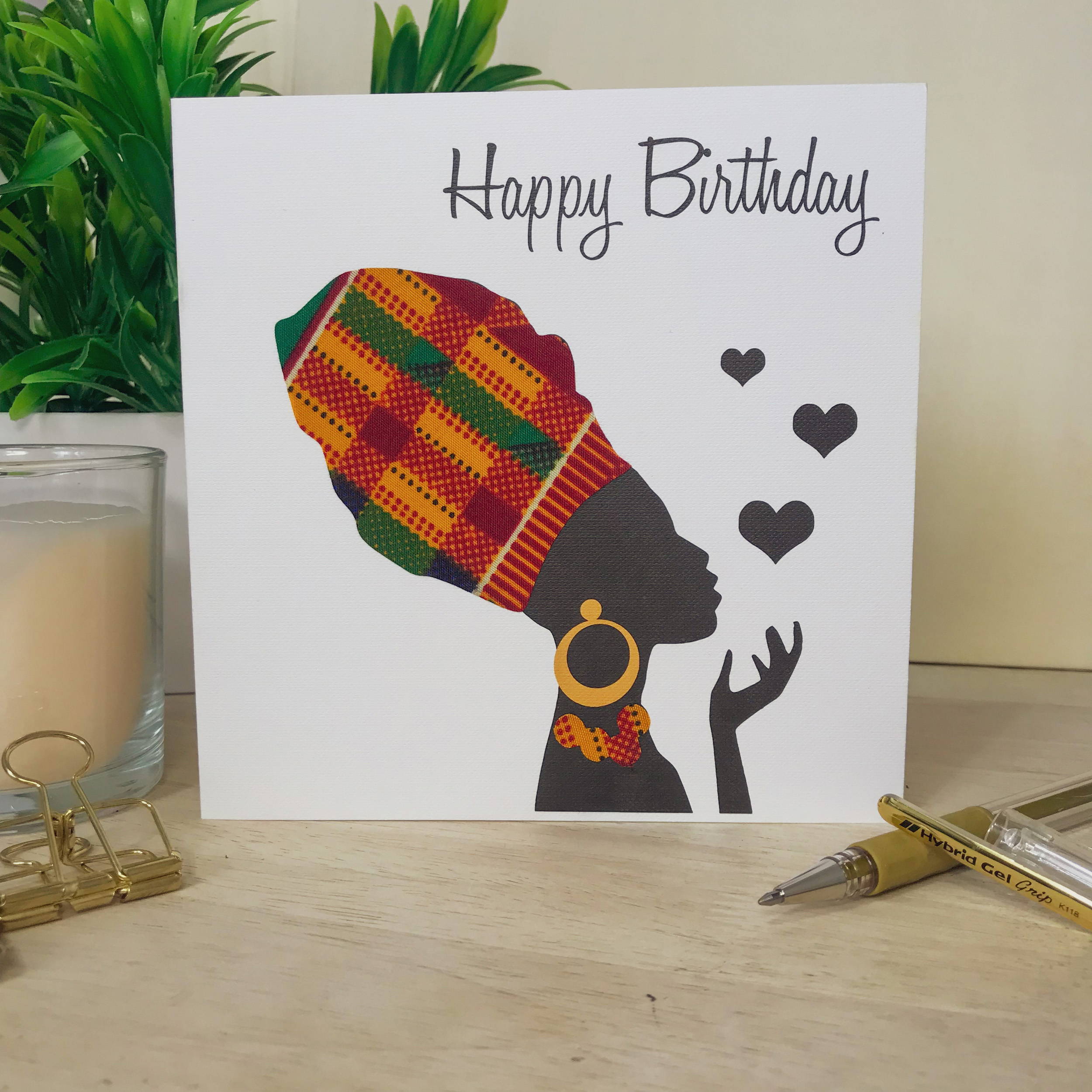
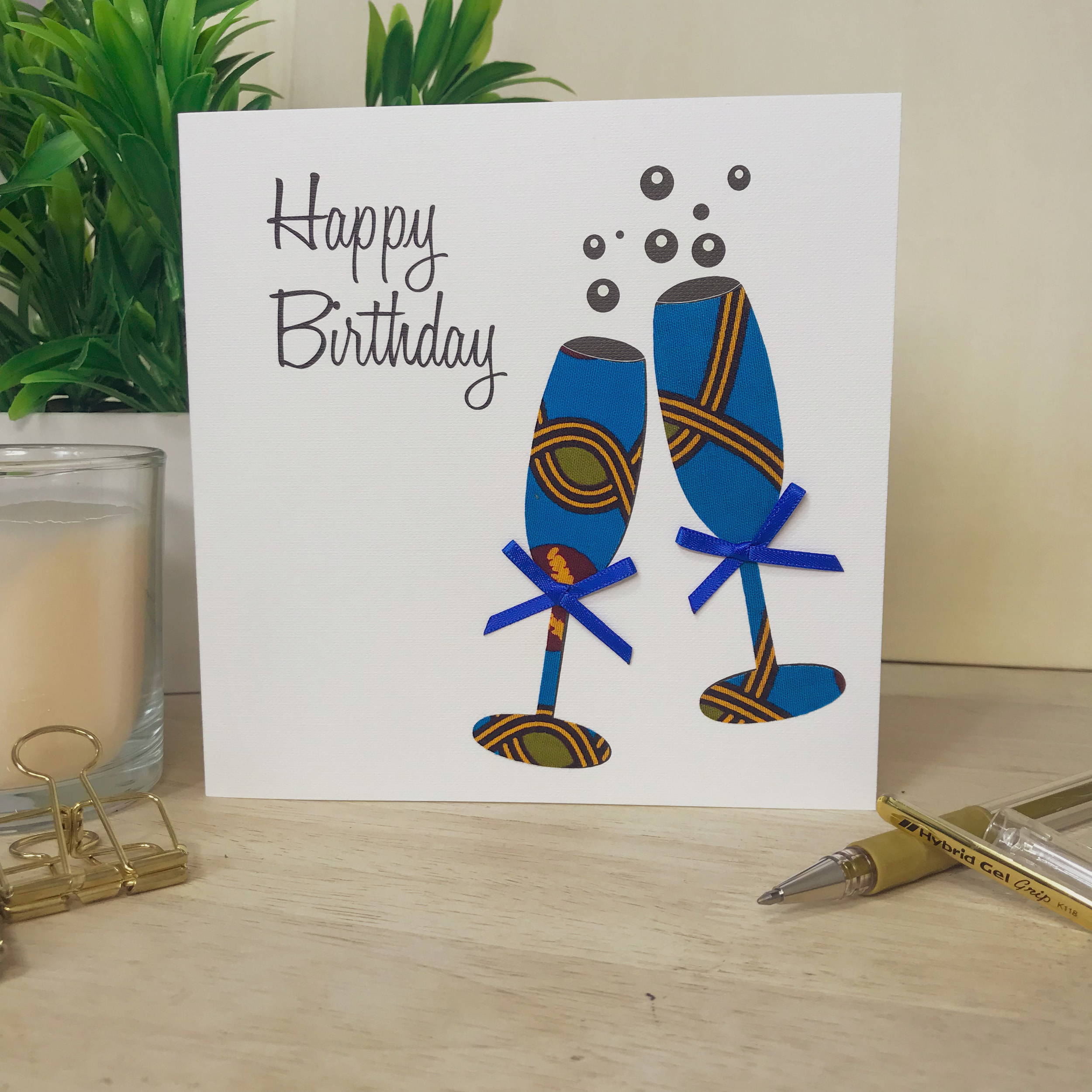
This range was conceived to break down diversity and inclusion barriers within the greeting card industry. Each card is individually hand-finished, incorporating one of three African wax print fabrics. Due to the nature of the fabric cut no two cards will ever be the same.
There are 32 designs in the range, with the cards printed on 350 gsm board and come smart sealed with a white envelope.
Georgina Fihosy, founder of AfroTouch Designs: “I am shocked, excited and very pleased to be part of the very first Best Diversity & Inclusion Range category in The Henries – helping to make history on such an important issue.
It has been a long time coming, but the industry as a whole really has moved forward on the diversity and inclusion fronts in the last few years. The launch of this dedicated award is part of that, and it is good to see that it is not just race, but gender and disability also being represented and appreciated.
It is good to see that the GCA has made a commitment to diversity, both in its activities and Council members, with the recent Sainsbury’s design competition for Black History Month being a great example how major retailers are recognising the need to embrace diversity and in doing so highlight the huge creative talent out there from the Black community.
The last few years have seen several major retailers become more open to having discussions about reflecting diversity in their greeting card selection as reflected in my AfroTouch Design cards on sale in Waterstones, John Lewis, Selfridges, Waitrose and soon to be TK Maxx. More importantly, the cards are selling, showing that there is an appetite from the card buying public. Of course, it is not just about being a Black publisher, you need to produce cards that people want to buy.
There is still progress to be made, but with every conversation comes greater understanding. Things are being talked about now, which in turn will encourage more diverse publishers to come forward and feel part of this great industry.”
Cath Tate Cartoons from Cath Tate Cards
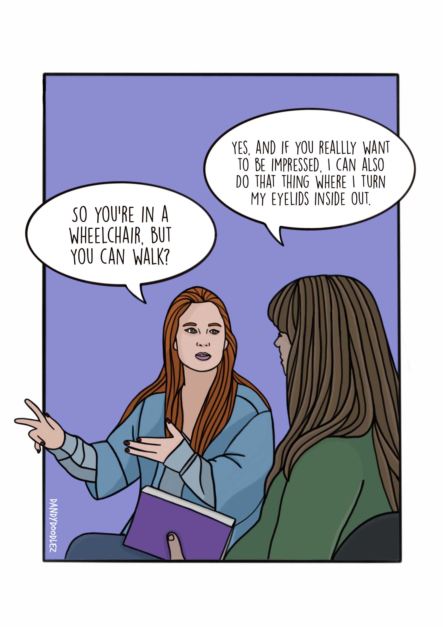
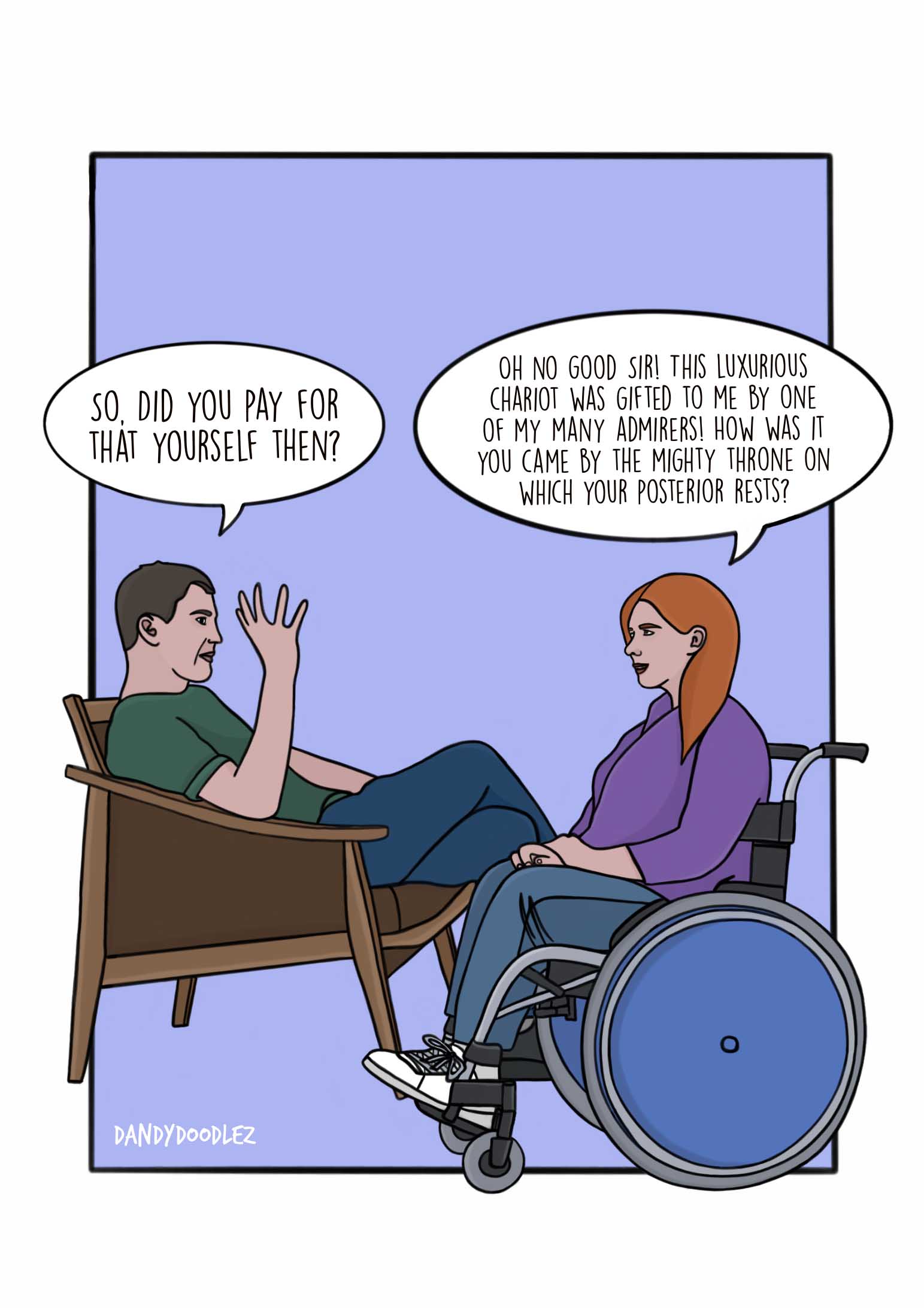
Cath Tate Cartoons is a long-standing range, with these disability focused designs being introduced in July 2020. This collection of designs is by artist Dandy Doodlez. Dandy’s primary focus is on queer and disability representation. The designs on the cards depict Dandy’s experiences of living with a disability – with an added healthy dose of humour.
Printed on high quality 100% recycled paper, the cards come with a white envelope.
Dandy Doodlez, creator of the designs: “I am absolutely delighted the range is getting attention…hopefully this nomination will demonstrate the need for representation within the industry.”
Rosie Tate, director of Cath Tate Cards: “We are so pleased that our cartoon card collection in collaboration with artist Dandy Doodlez has reached the finals of this new Henries award category. As one of the first ever disability representation greeting cards, these cards are unique and with over 11 million disabled people in the UK it feels like high time for a card range that represents those who are living with disabilities.
For us at Cath Tate Cards, diversity and inclusion has always been part of the core of our business. We like to think of ourselves as radicals with a sense of humour! We have always been keen to publish the work of artists who have been marginalised and our early card publishing was largely the work of alterative cartoonists/ artists and we sold predominately to fantastic independent shops like Gay is the Word and Diverse.
It feels like the greeting card industry has perhaps taken the first few steps towards increasing diversity and representation in greeting cards. How these steps ‘pan out’ in the future remains to be seen and it would be good to see retailers not just initially putting the product into stores but keeping the product in stores. What is on the shop floor is not just about what is the most commercial thing, but also about what creates change and difference, and big retailers can have a huge impact on that.”
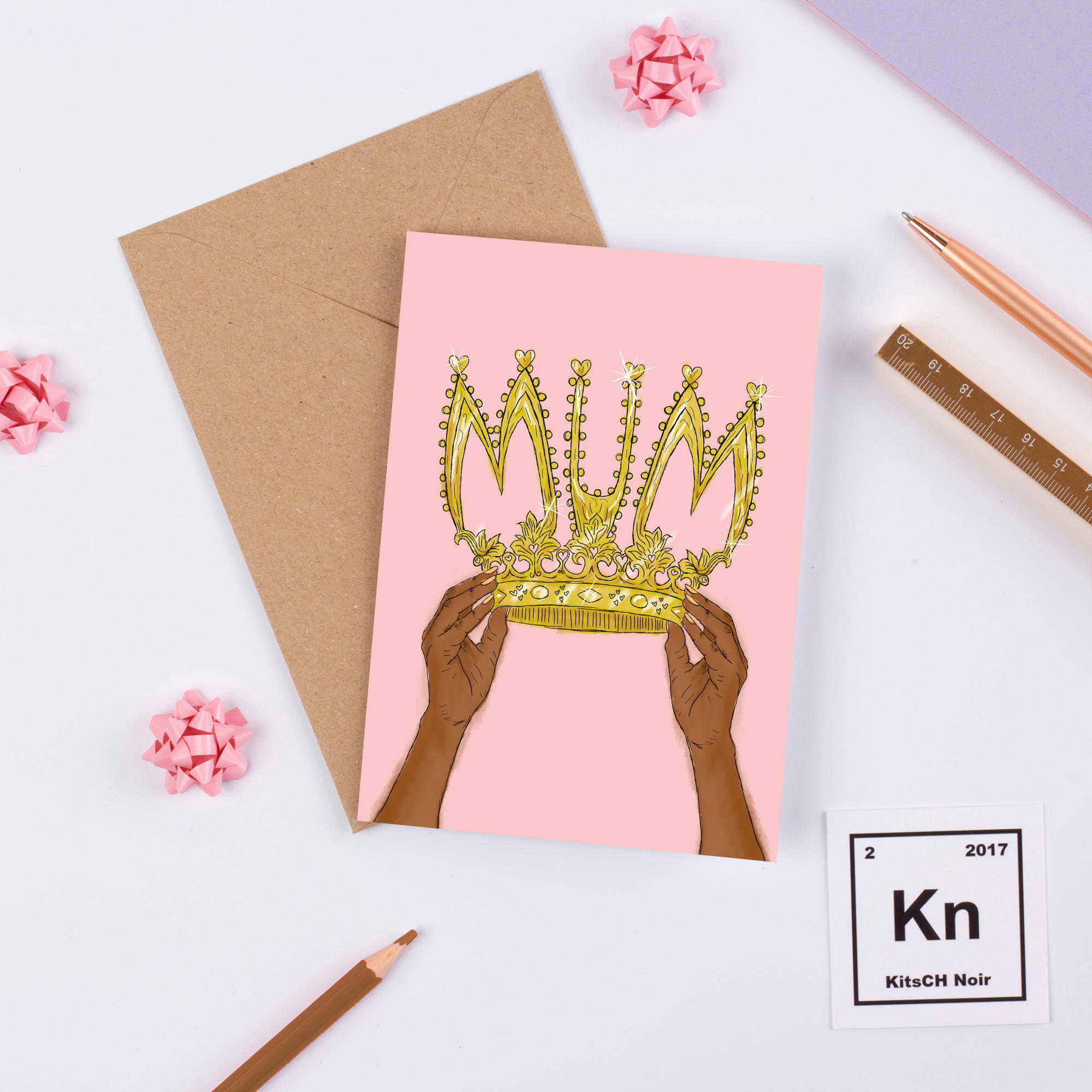
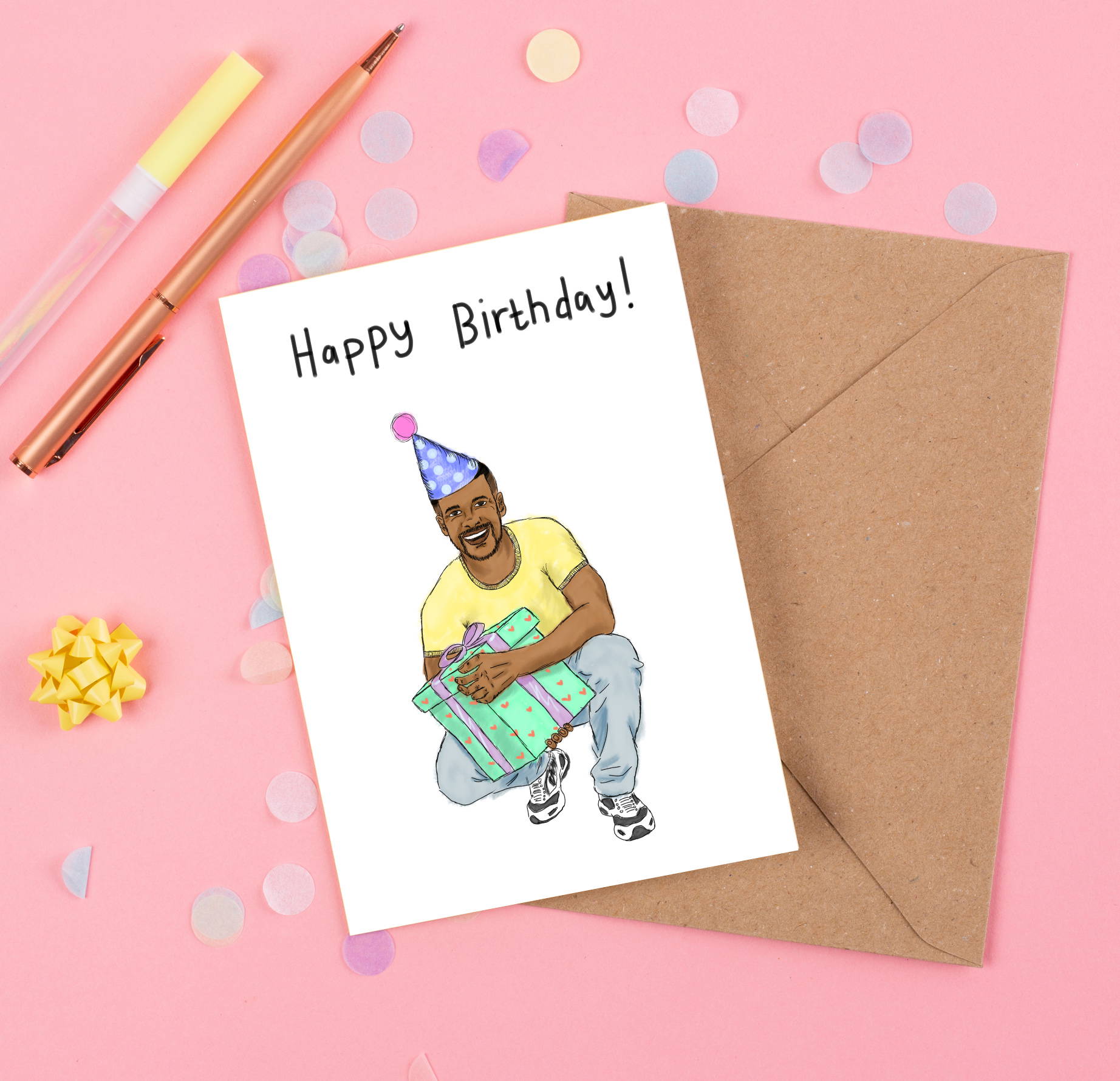
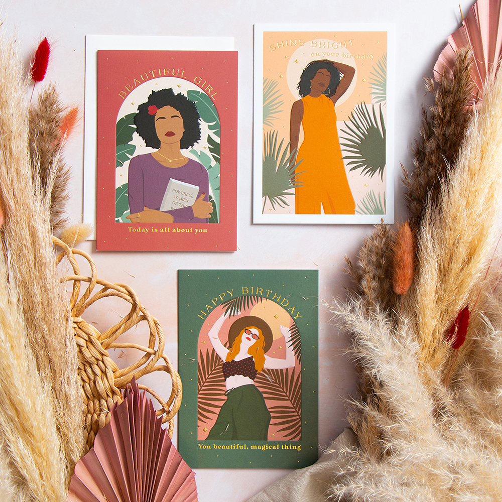
Family and Friends Collection from KitsCH Noir
KitsCH Noir’s designs cater for men, women and children.
The Family and Friends Collection is aimed at current millennials who have a diverse range of family and friends. The designs are appropriate for a wide range of ages and sexes, while totally representing the Black British community in all its glory!
There are 10 cards in the range and they are printed on Castillo Diamond White board.
Cherelle Brown, founder of KitsCH Noir: “I am really happy to be included in The Henries as a finalist for the second year running! I submitted a range which is very close to my heart and one which I believe has been long overdue within the industry. I am proud to finally be making a change for myself and my community.
I feel we are at the very start of such a big positive change in the greeting card industry and I am so proud to be part of this evolving movement. It is definitely a promising start and so wonderful to see everyone truly beginning to understand the importance of representation.
We are pleased that Tesco has joined Paperchase, Scribbler and others in now stocking our greeting cards, This is a massive achievement for KitsCH Noir, as when we first created the brand, the main mission was to make fun, fresh black greeting cards easily accessible to and for our
community, which meant being in high street stores and supermarkets. It’s been a long time coming, but we are happy to finally be making real change to the public’s shopping experiences across the whole UK.”
Embrace (Race) from Emotional Rescue

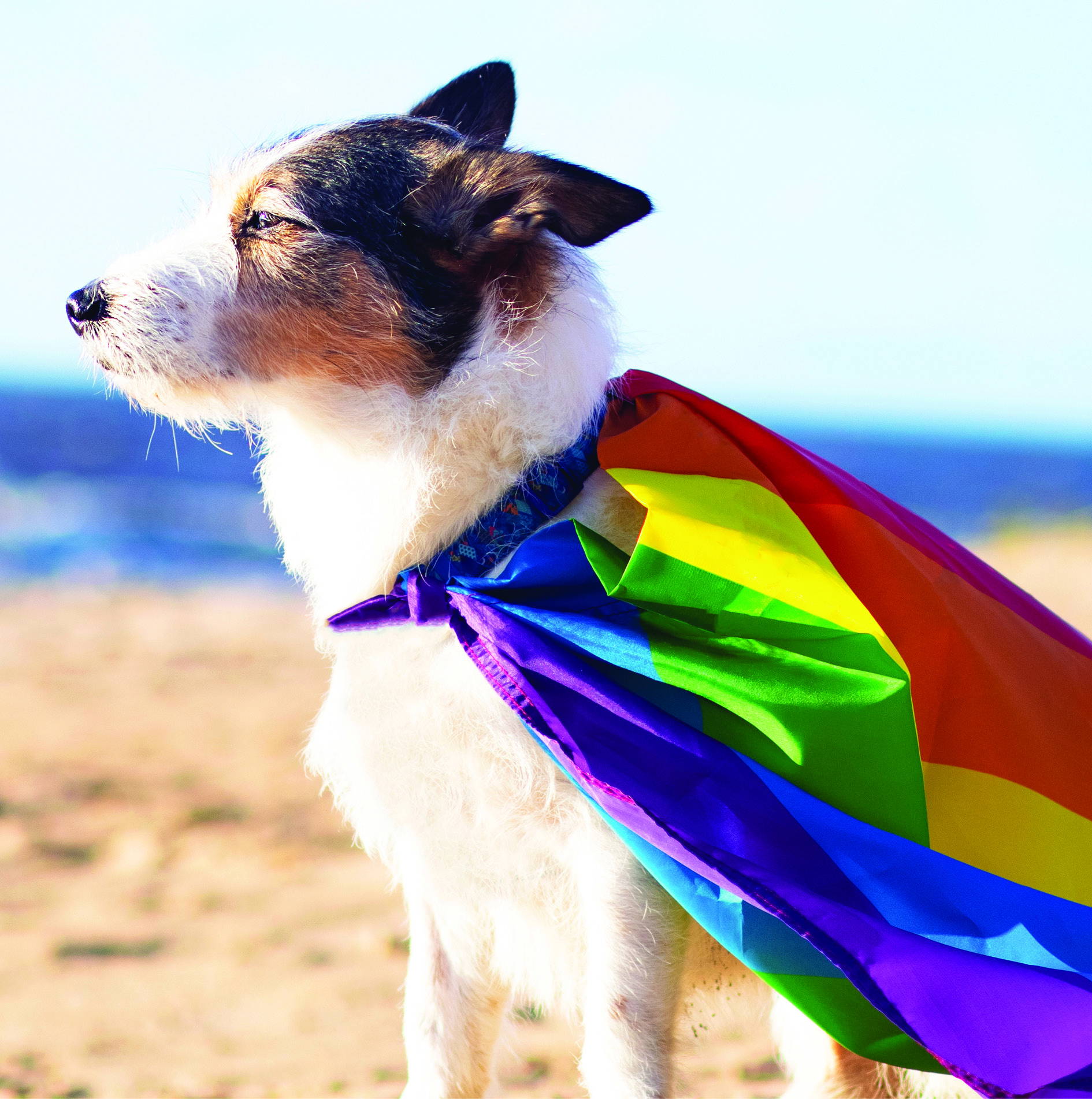
Emotional Rescue’s Embrace range delivers a contemporary view of the celebration of diversity and inclusion through photographic and graphical images. The collection includes 12 designs which are a celebration of race and another 12 in the Embrace (LGBTQ+) selection.
The cards are printed on 280gsm Incada silk with a velvet soft touch varnish.
Jennie Rutter, creative director of Emotional Rescue: “We were keen to create a range that celebrated gender and race, but was fully inclusive as well as commercial.
The essence of any greeting card is about the appropriateness, each design needs to be relevant to both the sender and the recipient. With Embrace, I sought to select images that would appeal to a broad cross section of people while still very much acknowledging diversity and inclusion.
I feel Embrace will have done its job if the same card design that will be sent between gay, trans or non-binary partners picking up on the rainbow reference or recognising a phrase from RuPaul’s Drag Race will also be bought by heterosexuals because they like the design.
The same is the case in the Race selection with the imagery acknowledging diversity, but also being beautiful as a piece of art. It is all about having the choice and keeping cards relevant.”
Fierce & Fabulous from The Art File
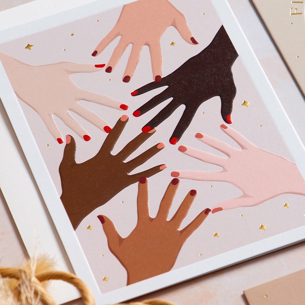
Fierce & Fabulous collection celebrates diversity and female empowerment. The designs, which capture a broad spectrum of ethnic and cultural diversity, take influences from the current trend of Bohemian and minimal aesthetics with a warm and inviting colour palette.
There are 16 designs in the range with the cards printed on a textured 280gsm FSC sustainable board, with debossing and tasteful gold foiling.
James Mace, sales and marketing manager of The Art File: “Everyone in the greeting card industry, as well as all other consumer product areas, has a responsibility to ensure that the products we produce are as inclusive as they can be, reflecting the diversity of the population.
Our launch of Fierce & Fabulous is very much part of that as is our ongoing Peace & Blessings Cultural Festivals collection, the result of our collaboration with Zakera Kali (founder of Peace & Blessings). We have learned so much from working with Zakera, not least the importance of not being scared about things you don’t know. By talking and listening, barriers are broken down and you gain a greater understanding of other people’s perspectives. Greeting cards may not be able to change the world, but they are very much part of relationships and need to be there for all – irrespective of colour, creed or gender.”
Hello Family from Lottie Simpson
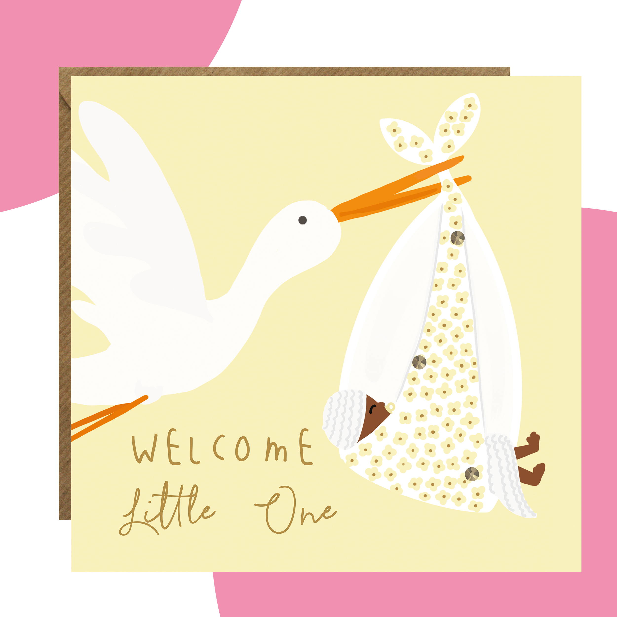
All families are different, but those family relationships are what bind people, irrespective of the colour of their skin, religious beliefs or sexual preference. This range encompasses designs of little ones holding hands with Grandad, walks in the park with Granny as well as same sex wedding cards.
There are 12 cards in the range, each of which are hand-finished with hand crafted crystals, printed on 300gsm, FSC luxury board and come with FSC-approved envelopes in a mix of fuchsia, yellow and kraft.
Lottie Simpson, founder of Lottie Simpson: “If there was one category to be a finalist in, it’s this one as it is so important. Over the last 12 months the industry has made a huge leap on its diversity and inclusion journey. Publishers large and small have started to introduce really wonderful cards into their ranges and the introduction of this category into the Henries is so positive and a powerful message of exactly what publishers should be working towards.
From the very beginning of our business, it was really important that our card ranges would be as inclusive and diverse as possible. It wasn’t difficult choosing what to illustrate as we listened to our customers. A case in point is our New Baby Stork card which is both diverse and gender neutral and has been a hit! And we’re far from finished; there’s so much more to come. We’re working on even more diverse and inclusive designs for both new ranges and extensions to our current ones.
As a smaller publisher we feel we are in the perfect position to introduce more and more diverse and inclusive cards and always welcome suggestions from anyone and everyone of what they’d like to see.”